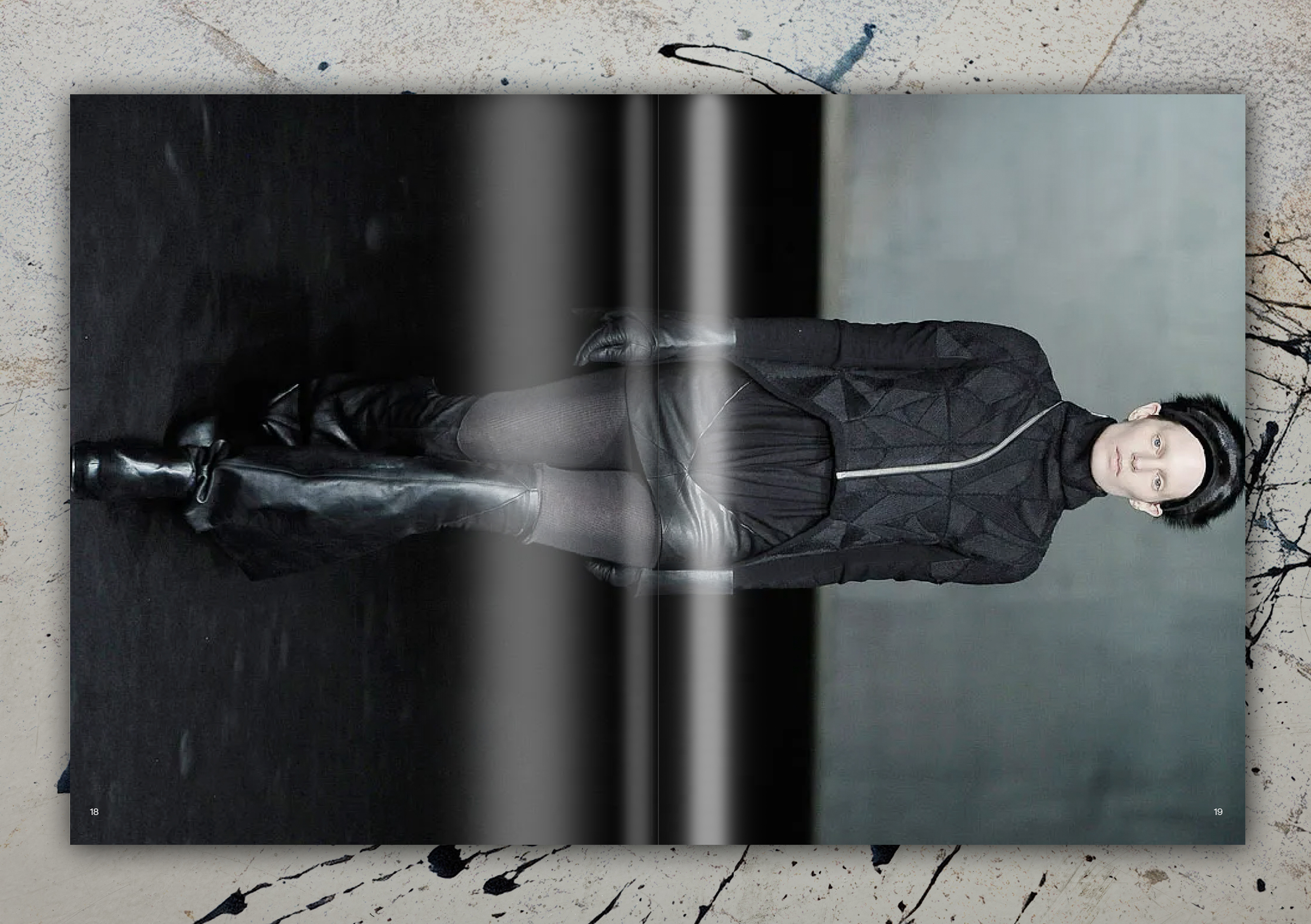
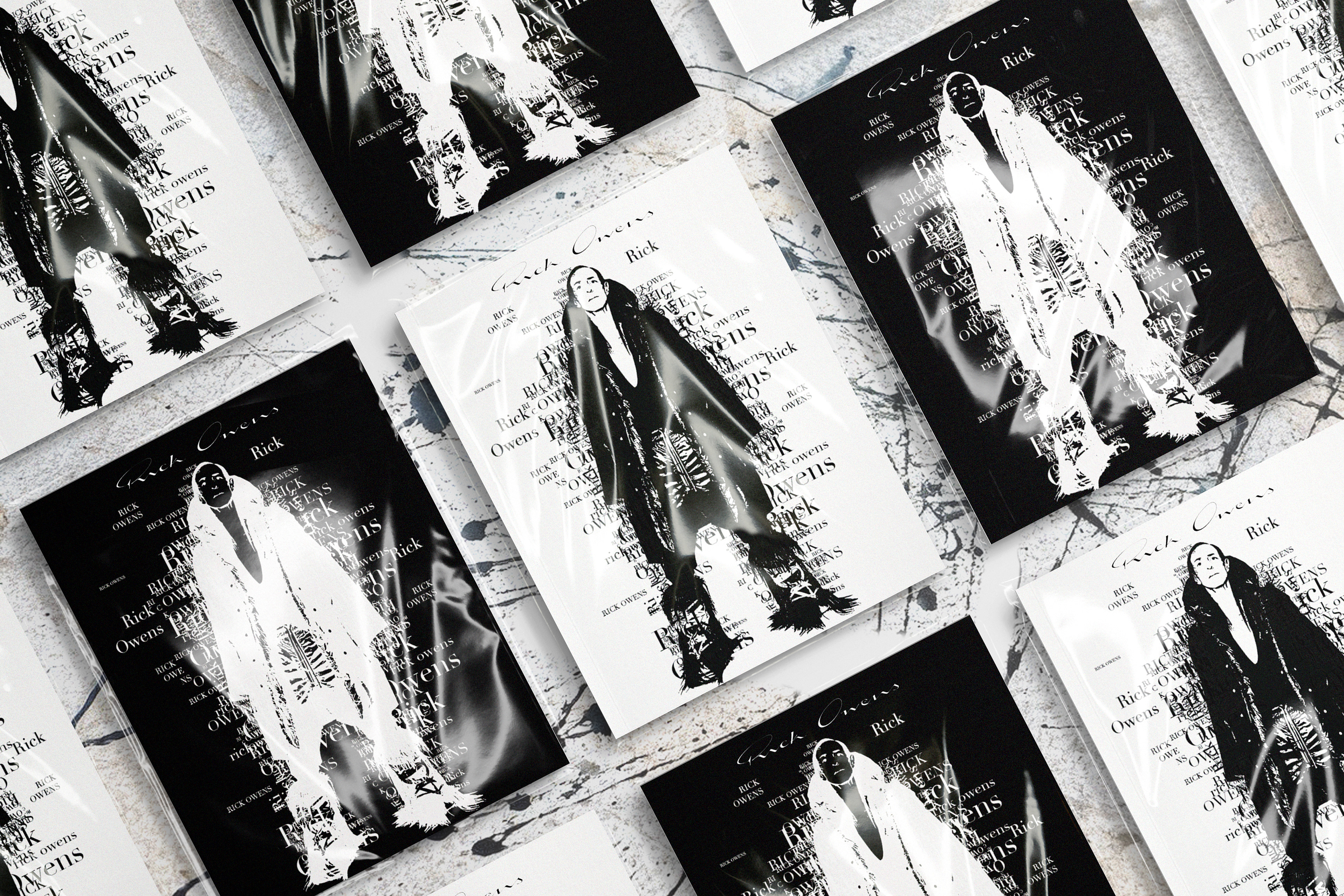
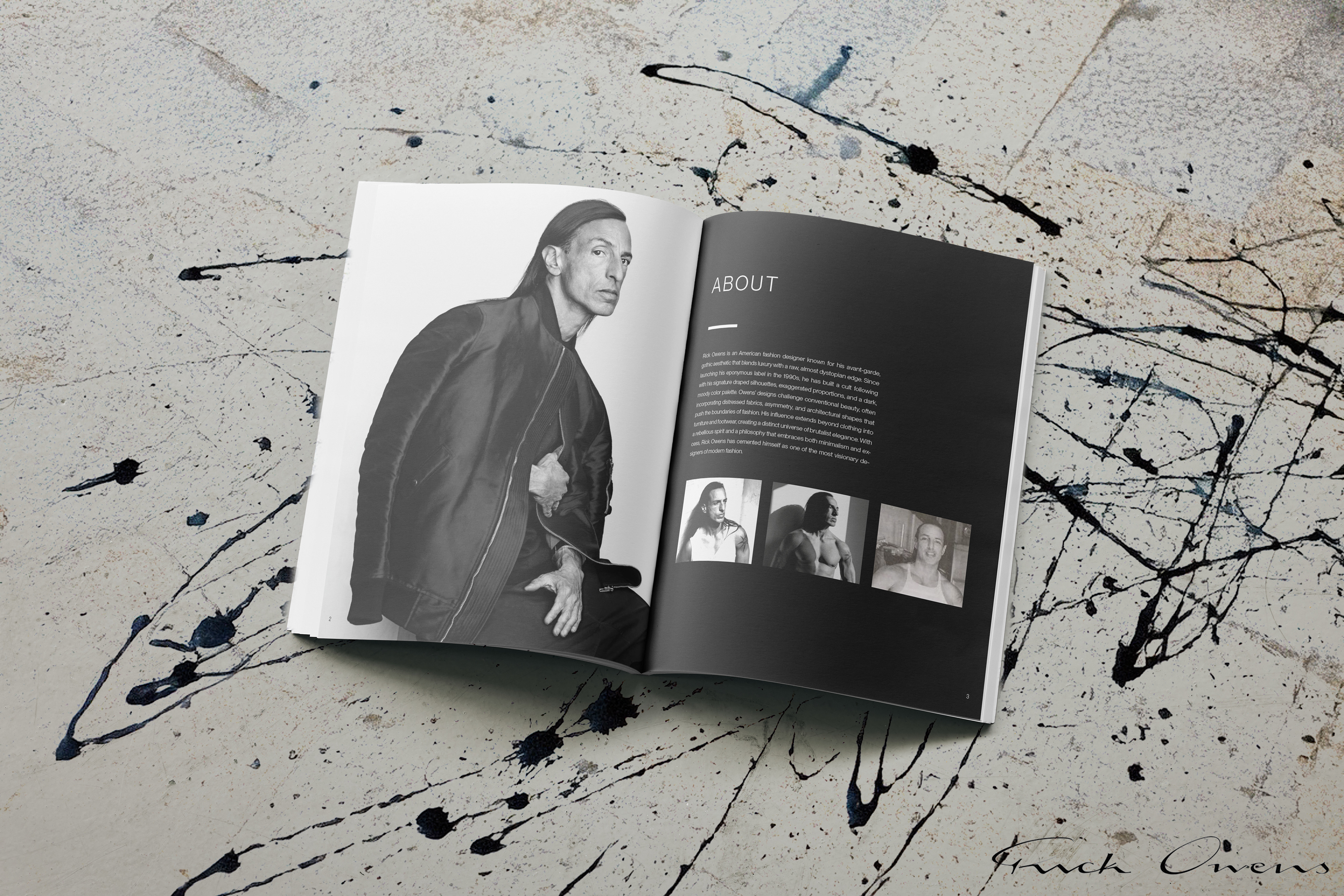
This magazine serves as a curated exploration of Rick Owens’ evolution, tracing his work from the beginning of his career to the present. Designed to reflect the brand’s signature avant-garde aesthetic, the layout emphasizes texture, contrast, and sculptural form.
Through bold yet minimal compositions, the magazine highlights Owens’ progression, showcasing how his dark, uncompromising vision has developed over time. By incorporating negative space and raw materiality, the design mirrors the essence of his work, allowing the garments’ forms and fabrics to drive the visual narrative. This project challenged me to translate fashion into graphic design, creating a catalog that not only documents Owens’ legacy but also immerses the reader in his world of deconstructed elegance.
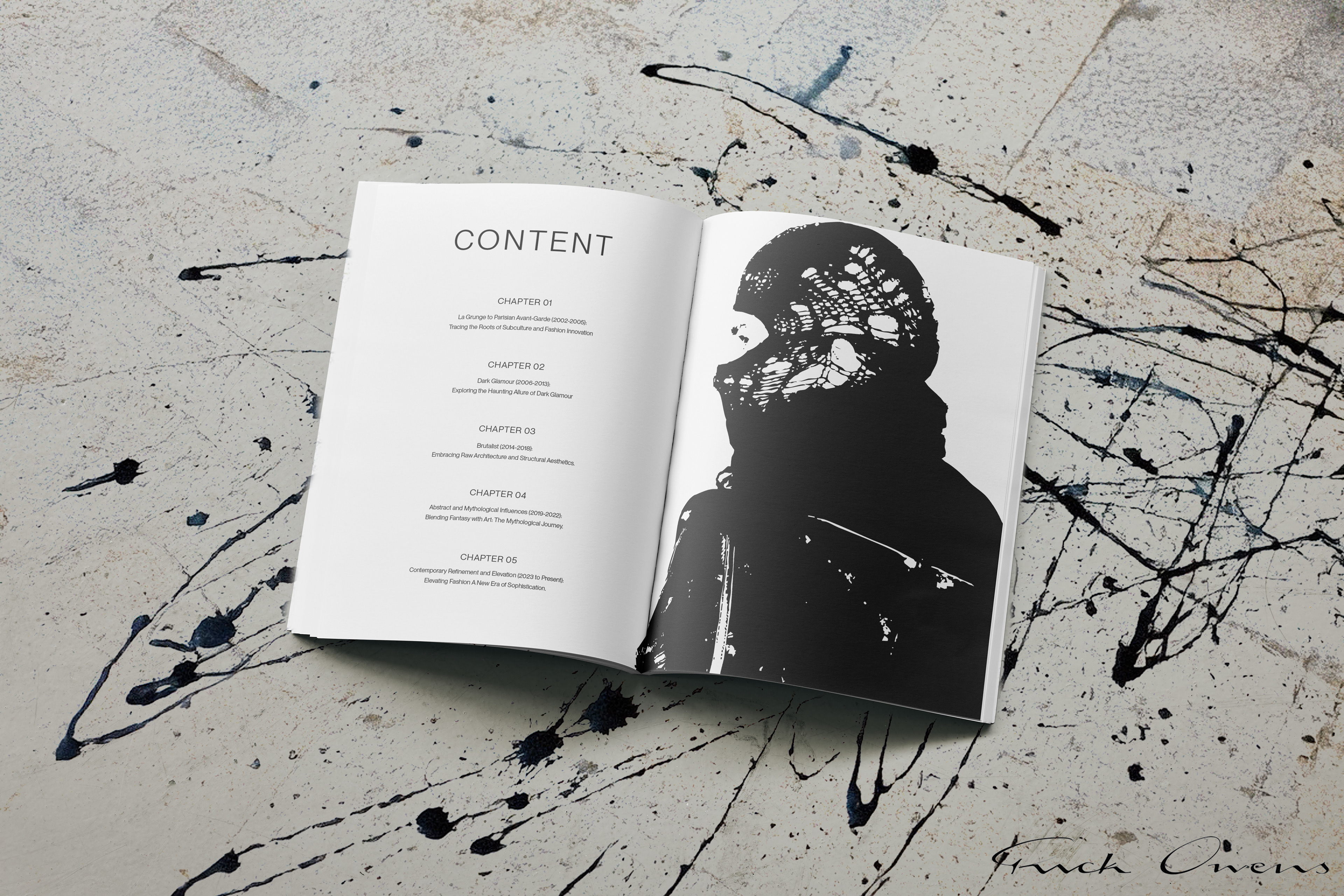
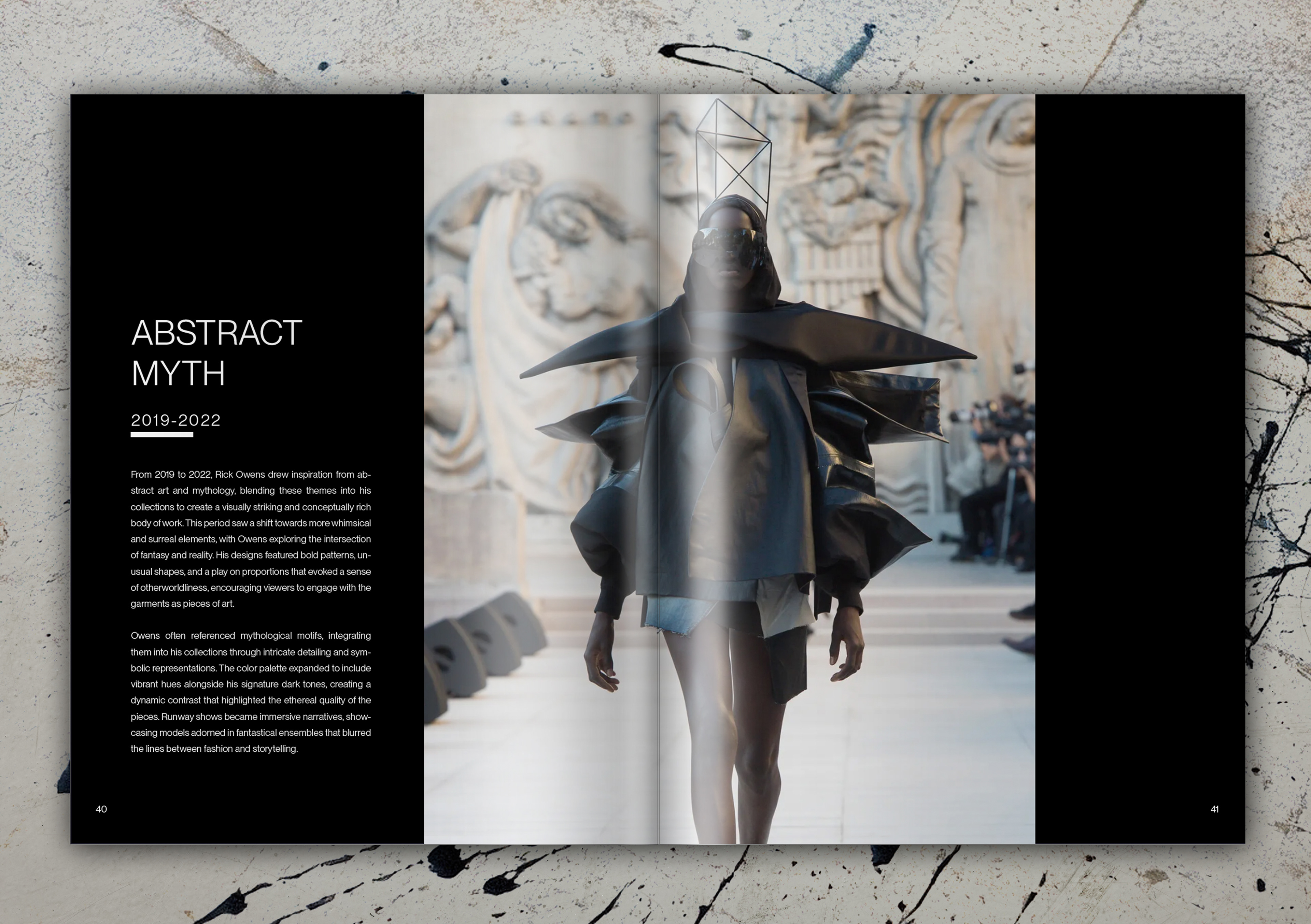
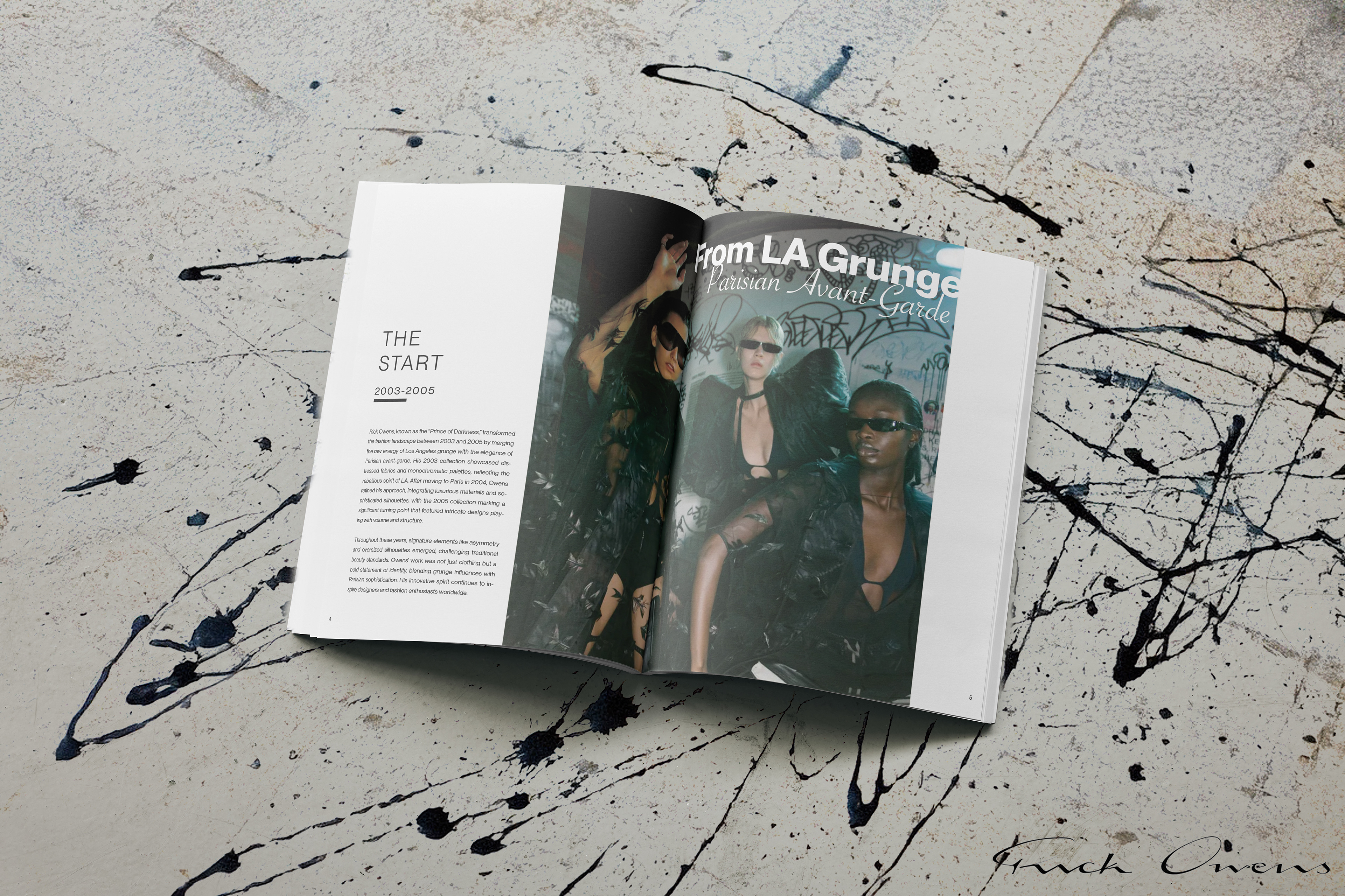
Defining Each Era
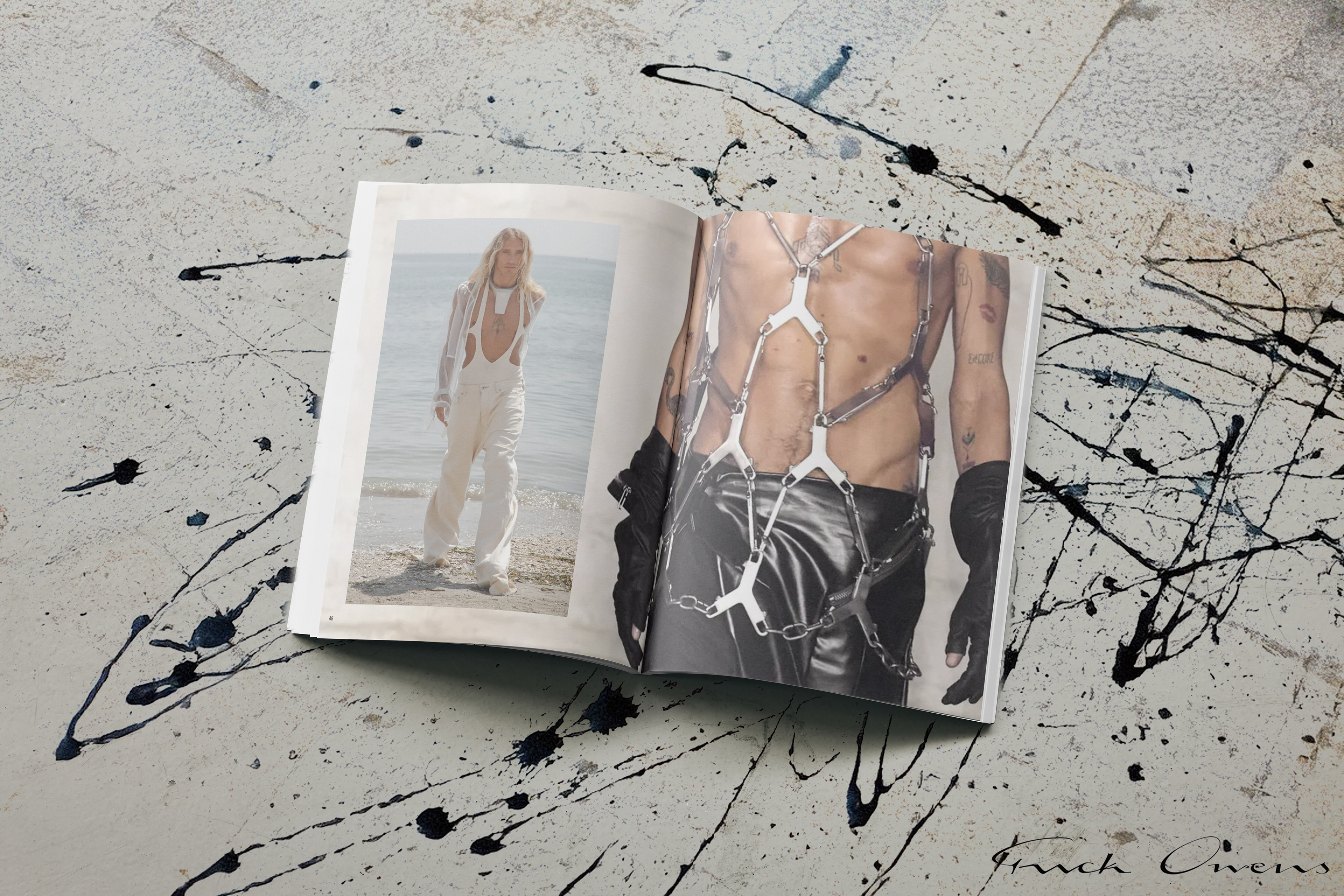
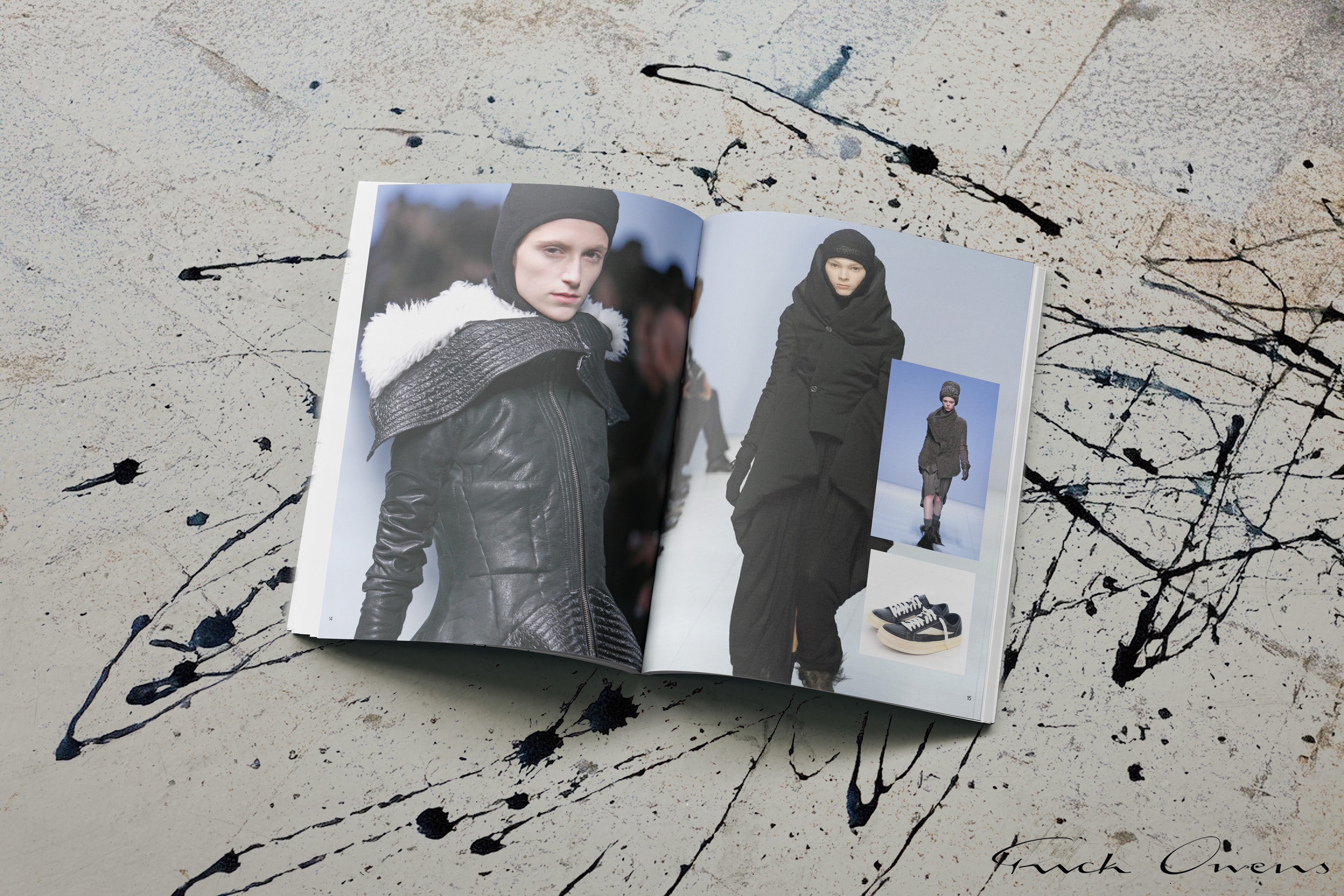
While the magazine is highly image-driven to let Rick Owens’ work take center stage, the divider and chapter pages provide essential context for any Rick Owens enthusiast. Each chapter is structured around a specific time period, tracing the evolution of his aesthetic and the shifts in his design philosophy over the years. These sections open with a dedicated spread, offering insight into the era’s defining characteristics, the overall mood, and how it departs from the previous phase. By balancing immersive visuals with thoughtful narration, the magazine not only showcases Owens’ work but also guides the reader through the progression of his avant-garde vision.